1. Top navi looks like this in IE7.

That’s because
display: inline-block;
css code dosen’t work on IE7.
2. Open header.php file
(yourdomain.com/wp/wp-content/themes/Divi/header.php)
3. Add this code in header.php.
1 2 3 | <!-- [/fusion_builder_column][fusion_builder_column type="1_1" background_position="left top" background_color="" border_size="" border_color="" border_style="solid" spacing="yes" background_image="" background_repeat="no-repeat" padding="" margin_top="0px" margin_bottom="0px" class="" id="" animation_type="" animation_speed="0.3" animation_direction="left" hide_on_mobile="no" center_content="no" min_height="none"][if IE 7]>
<link rel="stylesheet" href="http://yourdomain.com/ie7.css" type="text/css" />
<![endif]--> |
It looks like this.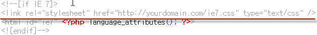
4. Make ccs file and save it in your domain root. File name: ie7.css
1 2 3 4 5 | #top-menu li{
display: inline-block;
*display: inline!important;
zoom: 1;
} |
done.
5. This is final css
1 2 3 4 5 6 7 8 9 10 11 12 13 14 15 16 17 18 19 20 21 22 23 24 25 26 | @charset "utf-8";
/* CSS Document */
#top-menu li{
    display: inline-block;
    *display: inline!important;
    zoom: 1;
}
/* Add left margin for main navi (메뉴 좌측에 여백) */
#et-top-navigation{
margin-left: 100px;
}
/* fix collapsed 4 column (4단 컬럼이 3단이 되는 현상) */
.et_pb_column{
margin-right: 40px!important;
}
/* fix collapsed 2/3 column (2/3 컬럼이 너무 넓어서 2줄로 되는 현상) */
.et_pb_column_2_3{
width: 600px!important;
} |
Hello! Thank you for the hints on resolving those problems! Also, please notice that the Divi theme marks the html tag with the version of IE. So you can specify css fixes in the theme options like this:
#ie7 .et_pb_column, #ie8 .et_pb_column {
margin-right: 40px!important;
}
In this case you won’t need to modify the header.php file (which will be overwritten every time your theme updates). ^__^